Construction Brand Design
Premium construction brand design for a local Altrincham client
"We were extremely pleased with the end result. Kurio Creative proposed some really great ideas. We hadn’t really considered the idea of a logo or icon but loved the idea of combining the 'A' and 'M' - it looks really effective. The monogram symbol was a simple, elegant and intelligent solution that completely evokes the spirit and craftmanship of the company. "
- Logo Design
- Art Direction
- Typography
- Brand Development
Client: Andmore Group
A premium construction brand design for a local Altrincham based business. Aimed at their target market of private individuals, land owners, developers and affordable housing providers that want to deliver high quality design led housing schemes. Their projects focus on high quality sustainable design and craftsmanship.
We were approached as a referral by an existing architectural client recommended for developing high quality creative brand and identity design work.
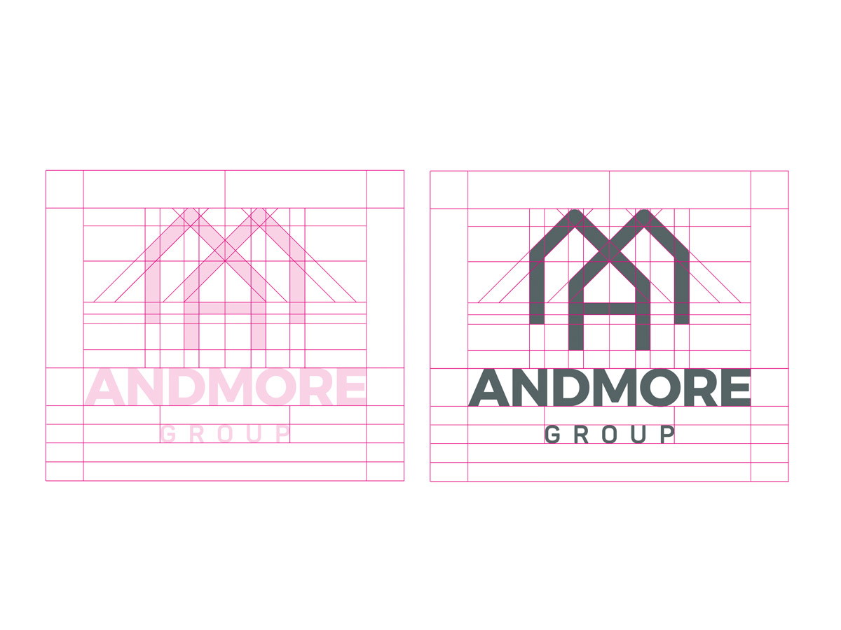
Kurio Creative developed a range of solutions to fit the client brief but also proposed an additional intelligent solution that encompassed what they do with the initials of the company, with the A and M intersecting to create a house like icon, the M symbolising a traditional roofline structure. This was the design that was selected and taken forward as their new identity.
For more information on the design services Kurio Creative provides, read more about us
