Corporate Identity Re-design
Corporate Identity re-design for an existing Altrincham based legal services client


- Logo Design
- Art Direction
- Typography
- Brand Guidelines
- Promotional collateral
- Signage
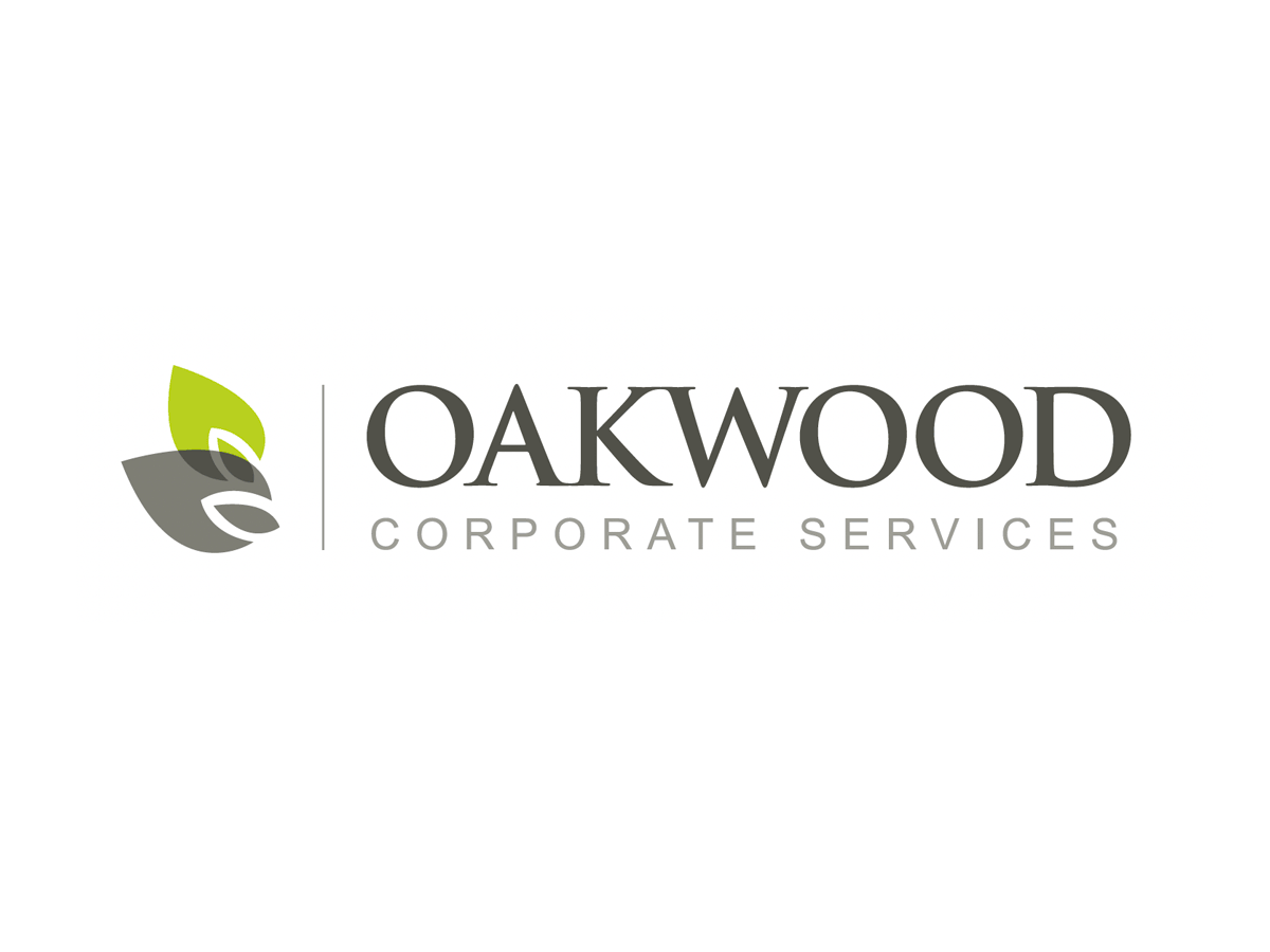
Client: Oakwood Corporate Services
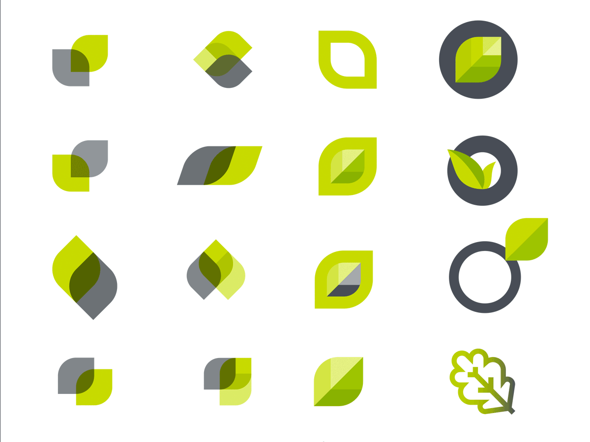
Every now an then a company or brand needs a ‘refresh’ to reflect any changes in the company whether it be services, growth or audience. Having worked with Oakwood since it’s inception (Kurio were the creators of the original logo and identity in 2010) we were perfectly placed to evolve the identity to reflect the more modern approach of its current business. The original logo and identity has served them well, but in a discovery session we soon established that we needed to take a fresh look at it.
The brief was to keep the core three leaf device that represents the ‘oak’ but to evolve it. Various solutions were designed and presented including updating the typeface with a more modern sans serif approach. This went down really well and before long the entire team was on board with the refresh.
The new identity was proudly rolled out across office signage, collateral, exhibition stands, advertisements and posters and we are soon to be working on a the website re-design.
Is your company in need of a Corporate Identity Re-design or refresh? Please get in Contact we would love to help you through the process.

